Today’s data tool challenges
A North American telecom company struggled for years trying to react quickly enough to new categories and new levels of spam texts and calls. They also did not have a good way to know when and why they would need additional capacity on their own, or any other telecom company’s networks. By enabling their event analysts to monitor and analyze events in real time, as well as directly in their data visualization tool, and also rate and give feedback to the system interactively, they increased their data to insight productivity by a factor of 10.
A large oil and gas company was suffering over not being able to offer users an easy and fast way to access the data needed to fuel their experimentation. This led them to fall behind. They had slower innovation in their consumer adapted services projects, when compared to competitors. To address this, they focused on creating an experimentation-oriented culture, enabled thanks to a cloud-native platform supporting the full data lifecycle. This platform, including an ad-hoc capable data warehouse service with built-in, easy-to-use visualization, made it easy for anyone to jump in and start experimenting. They also reduced the negative impact and cost that moving data between systems and tools had on their business. No longer would real-time data become stale before it landed in the hands of analysts and business innovators.
A pharmaceutical and life science company struggled in their research department. They were not able to quickly and easily query and analyze huge amounts of data as required. They also needed to combine text or other unstructured data with structured data and visualize the results in the same dashboards. These limited important every day insights that would expedite delivering safe medicines and vaccines to the market.
A couple of insurance companies were not able to visualize weather data together with time-sensitive incident data in their traditional visualization and data warehouse solutions, leaving room for doubt. Any ambiguity meant that they would have no legal substance to support their claims in fraud cases.
Our solution: Cloudera Data Visualization
Having immediate access to a visualization tool that can query a highly scalable and flexible cloud-native data warehouse is key for most businesses to expedite experimentation and stay ahead in the market. A solution like this will also make processes more efficient and allow business to learn how to automate costly system to system context switches faster – whether it be for data or users. Without a tool that allows people to collaborate and quickly share information across organizational borders (because the data is the same – it’s just the compute that may differ), managing the data will be far more expensive. Cost will be high not only due to system complexity, but there will be indirect costs to your business because of the time it will take to get accurate and reliable results.
The customers mentioned above overcame their data interaction challenges by utilizing the power of Cloudera’s modern data warehouse. Cloudera Data Warehouse (CDW) is available in a cloud-native form since last year (as part of the Cloudera Data Platform (CDP), in both Public and Private Cloud). CDW now includes a tech preview of its out-of-the-box insight and visualization tool, Cloudera Data Visualization.

Cloudera Data Visualization is in tech preview for CDW, with more backend engine integrations planned for the near future.
Cloudera Data Visualization allows users to interactively:
- Model the data in the virtual warehouse without extracting or modifying underlying data structures or tables
- Query large-sized data without loading data back and forth and incurring twice the cost
- Visualize data in a matter of minutes from a-z, and immediately share with data consumers or data scientists who can continue working on and extending from there in the very same tool
- Utilize in-application action extensions to speed up the path from insight to impact
Cloudera Data Visualization is built on three simple constructs:
- Data connections – Allows you to set up connections to any and all supported compute engines, be it SQL (Impala, Hive, MySQL), events and time series data (Druid or Impala over Kudu), unstructured data (Solr), or ML workloads (Spark et al), whatever you prefer.
- Data sets – The semantic layer on top of your metadata that allows you to model it into what you need for your visual application, while not touching, moving, or changing underlying data or tables.
- Visuals – The chart (out of many different flavors) in which you choose to present the data set for a specific data connection and that you can include and reuse in various dashboards.
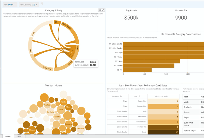
From these components, you can easily mix and match any backend compute engines that are better suited for certain data types, into one dashboard. You can select visuals, or get visuals recommended to you, and configure styles and extendable formats, to the very specific needs or preferences, of the user or line of business.

You can tie multiple visuals and filters (fixed or dynamic) into advanced dashboards – while reusing these visuals for other dashboards. You can link dashboards and have them depend on each other. You can tie multiple dashboards into applications, and rebrand them for your internal or external facing purposes. You can embed, extend, and configure them to the point where you can integrate your own actions and start accelerating automation – just like the Canadian telecom company mentioned above. They implemented a culture where IT, LoB application developers, and business users were kept in tight communication, as they all accessed the same tool and could iterate faster. By revising the dashboards continuously and with their end consumers close to provide quick and meaningful input, the developers gained more insights into patterns of usage. Combined with the in-tool usage patterns collected, it led to even more ML optimization opportunities, system, and automation process streamlining. These automations and optimizations could then be implemented in the very same application using the same tool – leading to tremendous gains and efficiency wins.
Get started!
How can you leverage this value? It is as easy as the click of a button! The data connection to the CDW virtual warehouse is automatically set up, as a default connection, so you can get started immediately designing your application.
To learn how to get started and how to build simple dashboards and advanced applications, using this tool, look for a series of future ‘how to’ blog posts.
Cloudera Data Visualization tech preview comes out of the box with CDW in CDP, which means no more wait times on access to data and insights. This means no more complex deployment paths and no more waiting for licenses or certifications. It is just there for you to start using!
This visualization tool is fully self-service., It is intuitive and easy to use, especially to anyone who has built dashboards in the past. It is all drag and drop and full of hints for the curious. If more help is needed, the tool has built-in getting started guidance and there is online training available.
Having a rich visualization layer that can be used and shared by both analysts and data scientists (yes, it is already part of CDP CML) fuels cross-organizational collaboration and speeds up the path to really useful applications. It sets the course to an experiment-driven culture – which we all know is key to stay relevant in competitive markets.
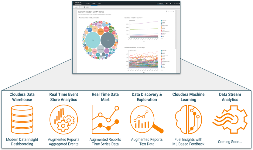
Cloudera Data Visualization is the same visual tool used across:
- Structured data, processed by an optimized SQL query engine
- Events or time-series data served by our real-time events or time-series data store solutions
- Text data served up via Solr’s powerful analytics engine and APIs
- All forms of data!
This alone should indicate how full of innovation opportunities this visualization tool is for you today and into the future! The ideas are limitless. Don’t wait any longer – get started today, and try out the tech preview yourself! Start by watching this introductory session.


