Data practitioners are consistently asked to deliver more with less, and although most executives recognize the value of innovating with data, the reality is that most data teams spend the majority of their time responding to support tickets for data access, performance and troubleshooting, and other mundane activities. At the heart of this backlog of requests is this: data is hard to work with, and it’s made even harder when users need to work to get or find what they need.
As a long-time partner to some of the largest enterprises in the world, we recognize the critical role Cloudera plays in making data teams and data consumers successful in their day-to-day work. That’s why we are rolling out a significant update to the Cloudera platform homepage, including a new set of features we designed to provide a more intuitive and efficient experience for data practitioners.
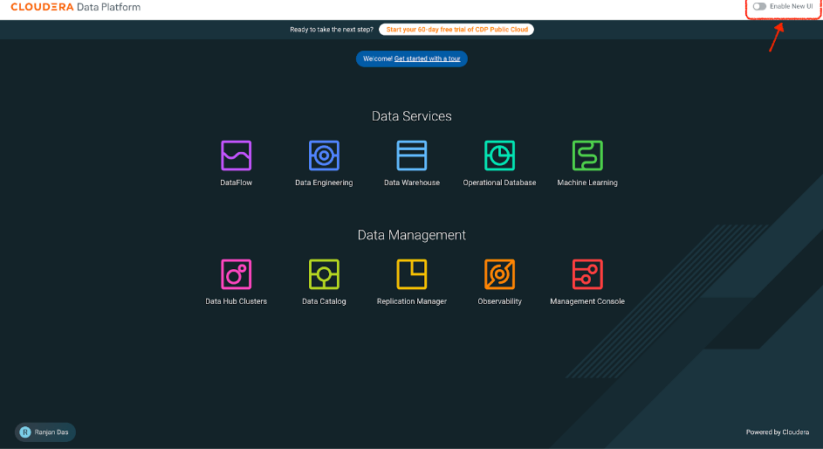
The decision to revamp the Cloudera UI was driven by our commitment to enhancing user experience and addressing the evolving needs of our customers. We have always listened closely to our users and tailored our solutions to meet their specific requirements. Over the years, our platform has grown in capability, offering a diverse range of services and tools. However, while the traditional tile-based homepage was functional, it did not fully support the intuitive navigation and quick access to information that our users require. This UI improvement ensures that our platform remains at the forefront of user-friendly design, making it easier for users to take advantage of the full potential of our services.
By implementing these changes, our goal is to create a more cohesive, intuitive, and efficient user interface that simplifies navigation, enhances the discoverability of features within the platform, and improves overall user productivity. With much quicker access to frequently used tools and services, integrated analytics for quick insights, comprehensive guides for exploring new solutions, and a powerful search function, users can now navigate the platform with greater ease and efficiency.
Key Enhancements:
- Streamlined Navigation:
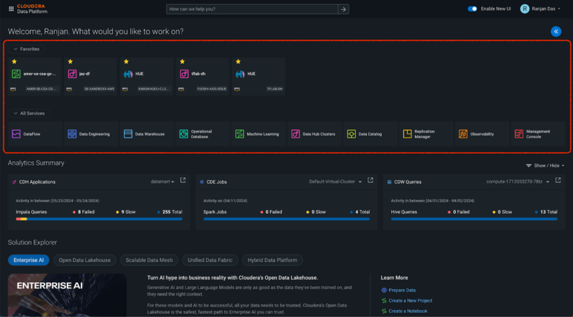
- Navigating through multiple pages to access frequently-used services and workspaces has historically been a time-consuming task for our users. The new Favorites feature addresses this problem by enabling users to bookmark their most frequently used Data Hubs, services, and workspaces, making them available wherever you open Cloudera. It ensures that users can quickly reach the tools and services they rely on the most, making their daily operations smoother and more efficient.
- Additionally, several changes have been made to streamline navigation across the platform. These enhancements reduce the number of clicks required, ensuring users can quickly reach the tools and services they are looking for.
- Analytics Summary:
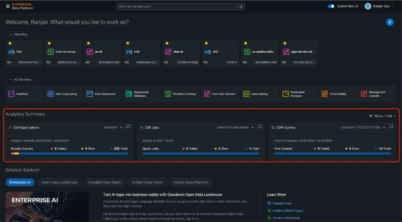
- It is essential for data teams to quickly access and understand the health and performance of their data services. The Analytics Summary section addresses this need by integrating key Observability Dashboard metrics directly into the homepage. Users can now view a summary of analytics for individual clusters and virtual warehouses without navigating away from the main page. This section enables users to select and display operational insights for specific services, such as Data Hub, Data Engineering, and Data Warehouse, providing immediate insights into their operations. Bringing these metrics to the homepage helps users monitor performance and make data-driven decisions more effectively.
- Solution Explorer:
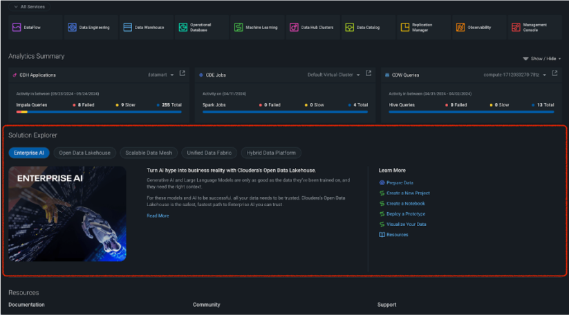
- The Solution Explorer section is designed to help users discover and explore new innovations within the Cloudera platform tailored to specific roles and needs. It offers a comprehensive guide to various solutions, including Enterprise AI, Open Data Lakehouse, Scalable Data Mesh, Unified Data Fabric, and Hybrid Data Platform, with more to come! This section provides detailed descriptions and relevant documentation for users whose roles benefit from these capabilities, such as data scientists, analytics professionals, and database administrators. By centralizing information about Cloudera’s latest innovations, the Solution Explorer makes it easier for users to stay informed and leverage the full potential of the platform’s capabilities.
- Quick Start:
- The Quick Start section is designed to help users perform essential data tasks with ease and efficiency. This section offers a step-by-step guide for common activities, such as connecting to or importing data, querying and transforming data, and visualizing data. Each guide includes links that take users directly to the relevant sections in Cloudera’s documentation, providing a supportive experience for both new and experienced users.

- Documentation Search:
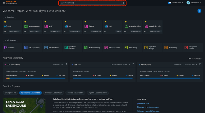
- The new Documentation Search feature adds a convenient search bar at the top of the homepage, enabling users to quickly find the information they need within Cloudera’s extensive documentation. Whether you need guidance on a specific feature, troubleshooting tips, or detailed technical documentation, the Documentation Search makes it easy to access the comprehensive resources available.
We’re rolling out this new UI gradually, and we’d love for you to try it out. You can enable the new homepage by clicking the “Enable New UI” toggle button in the top-right navigation bar. We know many of our customers are comfortable using the current UI, and that’s fine! You can opt in or opt out with the click of a button.
This homepage update is just the beginning. The new UI is designed to expand beyond the homepage, and we will gradually integrate it into individual services across the platform. Our vision is to make it easier than ever for our customers to deliver actionable insights to the business by providing the most intuitive and user-friendly experience for working with data.
We encourage you to explore the new homepage and share your thoughts. Your feedback is crucial in helping us refine and improve the Cloudera experience for all users.


