Apache Spark is one of the most popular engines for distributed data processing on Big Data clusters. Spark jobs come in all shapes, sizes and cluster form factors. Ranging from 10’s to 1000’s of nodes and executors, seconds to hours or even days for job duration, megabytes to petabytes of data and simple data scans to complicated analytical workloads. Throw in a growing number of streaming workloads to huge body of batch and machine learning jobs — and we can see the significant amount of infrastructure expenditure on running Spark jobs. Costs that could be optimized by reducing wastage and improving the efficiency of Spark jobs. Another hidden but meaningful cost is developer productivity that is lost in trying to understand why Spark jobs failed or are not running within desired latency or resource requirements. There is a lot of data scattered across logs, metrics, Spark UI etc. that needs to be collected, parsed and correlated to get some insights but not every developer has the deep expertise needed for that analysis. And the sheer scale of Spark jobs, with 1000’s of tasks across 100’s of machine, can make that effort overwhelming even for experts. To validate this hypothesis, we interviewed a diverse set of our users, and indeed found that their top of mind issue was getting easy to understand and actionable visibility into their Spark jobs. So we decided to do something about it.
Our objective was to build a system that would provide an intuitive insight into Spark jobs that not just provides visibility but also codifies the best practices and deep experience we have gained after years of debugging and optimizing Spark jobs. The main design objectives were to be
- Intuitive and easy – Big data practitioners should be able to navigate and ramp quickly
- Concise and focused – Hide the complexity and scale but present all necessary information in a way that does not overwhelm the end user
- Batteries included – Provide actionable recommendations for a self service experience, especially for users who are less familiar with Spark
- Extensible – To enable additions of deep dives for the most common and difficult scenarios as we come across them
Here is a sneak preview of what we have been building. We will try to analyze a run of TPC-DS query 64 on a cloud provider and see if we can identify potential areas of improvement.
A bird’s eye view of the entire Spark application execution
When first looking at an application, we often struggle with where to begin because of the multitude of angles to look at. To help with that problem, we designed a timeline based DAG view. It tries to capture a lot of summarized information that provides a concise, yet powerful view into what happened through the lifetime of the job. The intent is to quickly identify problem areas that deserve a closer look with the concept of navigational debugging.
Spark execution primer
Let’s start with a brief refresher on how Spark runs jobs. It does that by taking the user code (Dataframe, RDD or SQL) and breaking that up into stages of computation, where a stage does a specific part of the work using multiple tasks. Stages depend on each other for input data and start after their data becomes available. After all stages finish successfully the job is completed. These stages logically produce a DAG (directed acyclic graph) of execution. E.g. a simple wordcount job is a 2 stage DAG – the first stage reads the words and the second stage counts them. However, for most Spark jobs its not easy to determine the structure of this DAG and how its stages got executed during the lifetime of the job. Being able to construct and visualize that DAG is foundational to understanding Spark jobs.
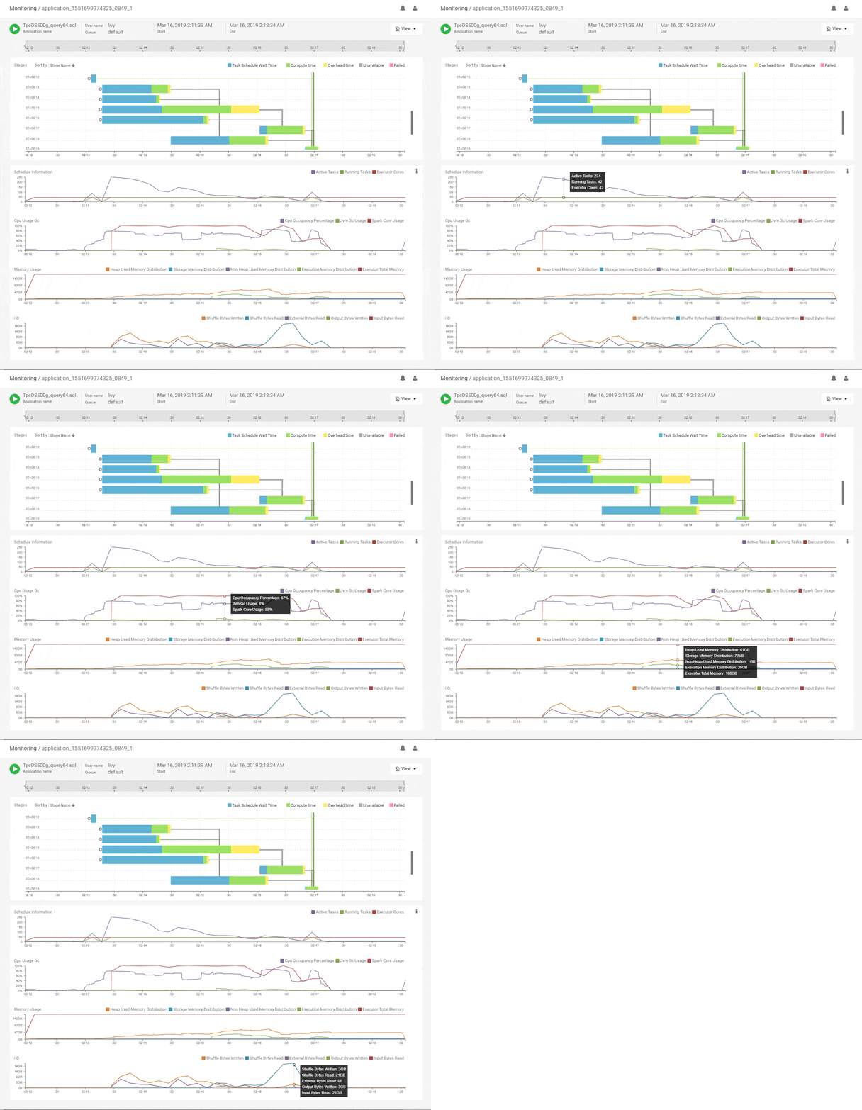
We start with the DAG view of the Spark application that shows the structure of the DAG and how it executed over time along with key metrics for scheduling and resources. The horizontal axes on all charts are aligned with each other and span the timeline of the job from its start to its end. This immediately shows which stages of the job are using the most time and how they correlate with key metrics. Above, we see that the initial stages of execution spent most of their time waiting for resources. Scanning vertically down to the scheduling stats, we see that the number of active tasks is much higher compared to the available execution cores allocated to the job. That explains the waiting time and the best way to speed up these stages would be to add more executors. The CPU metrics shows fairly good utilization of the Spark CPU cores at about 100% throughout the job and its matched closely by actual CPU occupancy showing that Spark used its allocated compute effectively. The memory metrics group shows how memory was allocated and used for various purposes (off-heap, storage, execution etc.) along the timeline of the application. We can clearly see a lot of memory being wasted because the allocation is around 168GB throughout but the utilization maxes out at 64GB. We can reduce the memory allocation and use the savings to acquire more executors, thereby improving the performance while maintaining or decreasing the spend. Flexible infra choices from cloud providers enable that choice. Thus, we see that we can quickly get a lot of actionable information from this intuitive and time correlated bird’s eye view.
Concise Stage Summary
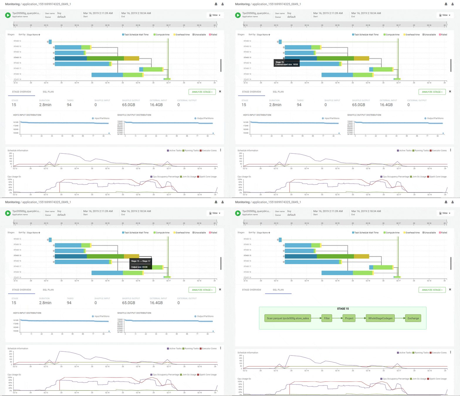
Clicking on a stage in the DAG pops up a concise summary of the relevant details about a stage including input and output data sizes and their distributions, tasks executed and failures. The DAG edges provide quick visual cues of the magnitude and skew of data moved across them. Hint – Thicker edges mean larger data transfers. A quick look at the summary for stage-15 shows uniform data distribution while reading about 65GB of primary input and writing about 16GB of shuffle output.
Did you ever wonder which part of the query ran in which stage?
On the Apache Spark UI, the SQL tab shows what the Spark job will do overall logically and the stage view shows how the job was divided into tasks for execution. But it takes a Spark SQL expert to correlate which fragment of the SQL plan actually ran in a particular stage. We did the hard work to uncover that elusive connection for you and its available in the SQL tab for a given stage. You are welcome!
Where exactly is the skew in the job…
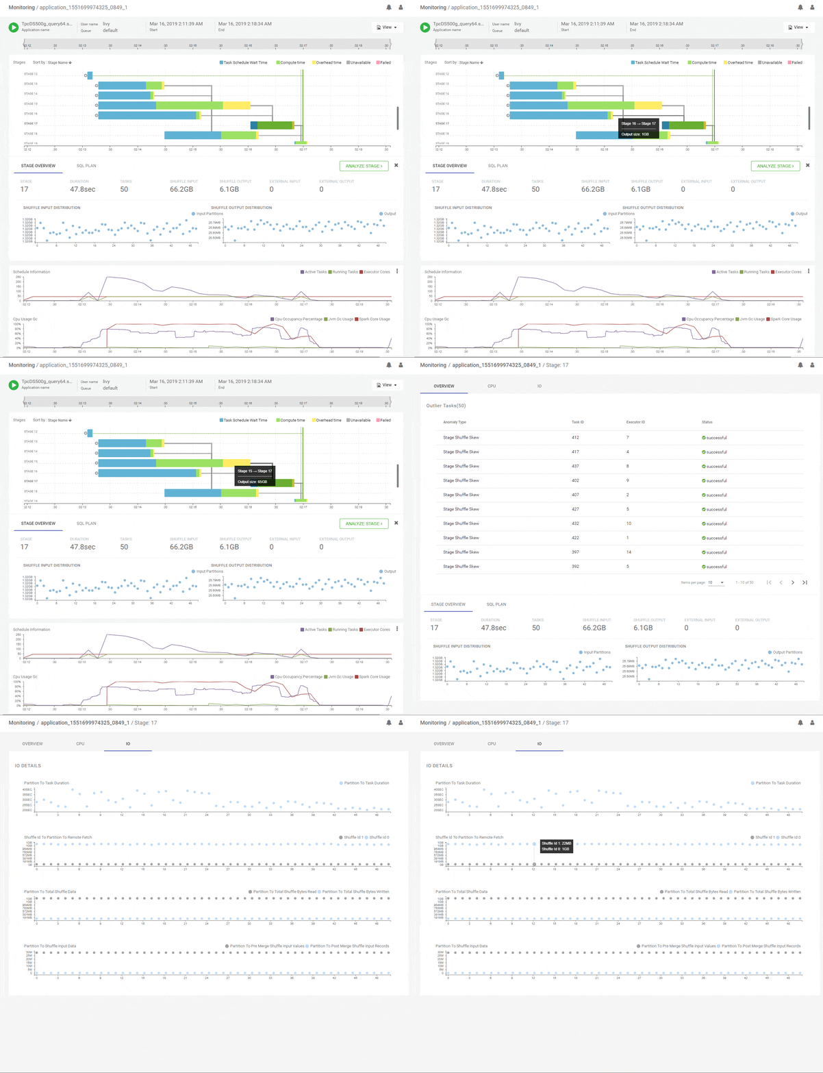
Data skew is one of the most common problems that frustrate Spark developers. We saw earlier how the DAG view can show large skews across the full data set. But often skews are present within partitions of a data set and they can be across the key space or the value space of the partition. We will identify the potential skewed stages for you and let you jump into a skew deep dive view. Here, we present per-partition runtimes, data, key and value distributions, all correlated by partition id on the horizontal axis. Now there is no place left for those pesky skews to hide! Below, we analyse the join stage-17 for potential issues and we can see that the join inputs are very different in overall size – 65GB vs 1GB – and the stage is doing a shuffle join. and we can see that skewed tasks have already been identified. We can analyze the stage further and observe pre-identified skewed tasks. Further, we can look at per-partition correlated metrics that clearly show that all partitions have skewed inputs with one side much larger than the other. We may conclude that this join could be significantly improved by using a broadcast strategy.
Which code occupied the most time?
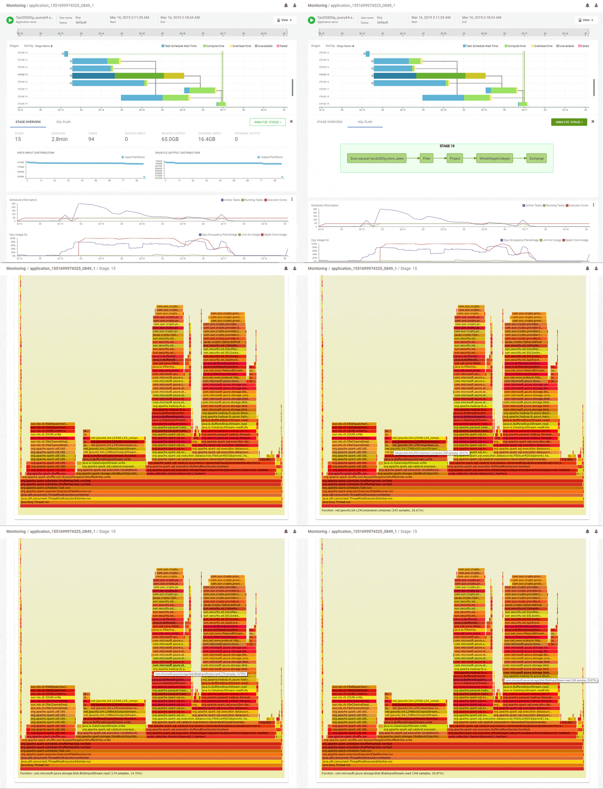
Another common strategy that can help optimize Spark jobs is to understand which parts of the code occupied most of the processing time on the threads of the executors. Flame graphs are a popular way to visualize that information. But the difficulty in applying that for Spark jobs is that tasks for different stages can run across multiple executors and in fact, tasks from different stages could be running concurrently across different threads in a particular executor. And all that needs to get properly handled before an accurate flame graph can be generated to visualize how time was spent running code in a particular stage. We are happy to help do that heavy lifting so you can focus on where to optimize your code. Not only that, we pre-identify outliers in your job so you can focus on them directly. Below, in the DAG summary we can see that stage-15 spent a lot of its time running code with a significant IO overhead. It did do a lot of IO – about 65GB of reads and 16GB of writes. Analyzing stage-15 for CPU shows the aggregate flame graph with some interesting information. About 20% of the time is spent in LZO compression of the outputs which could be optimized by using a different codec. Another 35% was spent reading inputs from cloud storage. This could be for various reasons like avoidable seeks in the data access or throttling because we read too much data. These issues are worth investigating in order to improve the query performance.
What about failures?
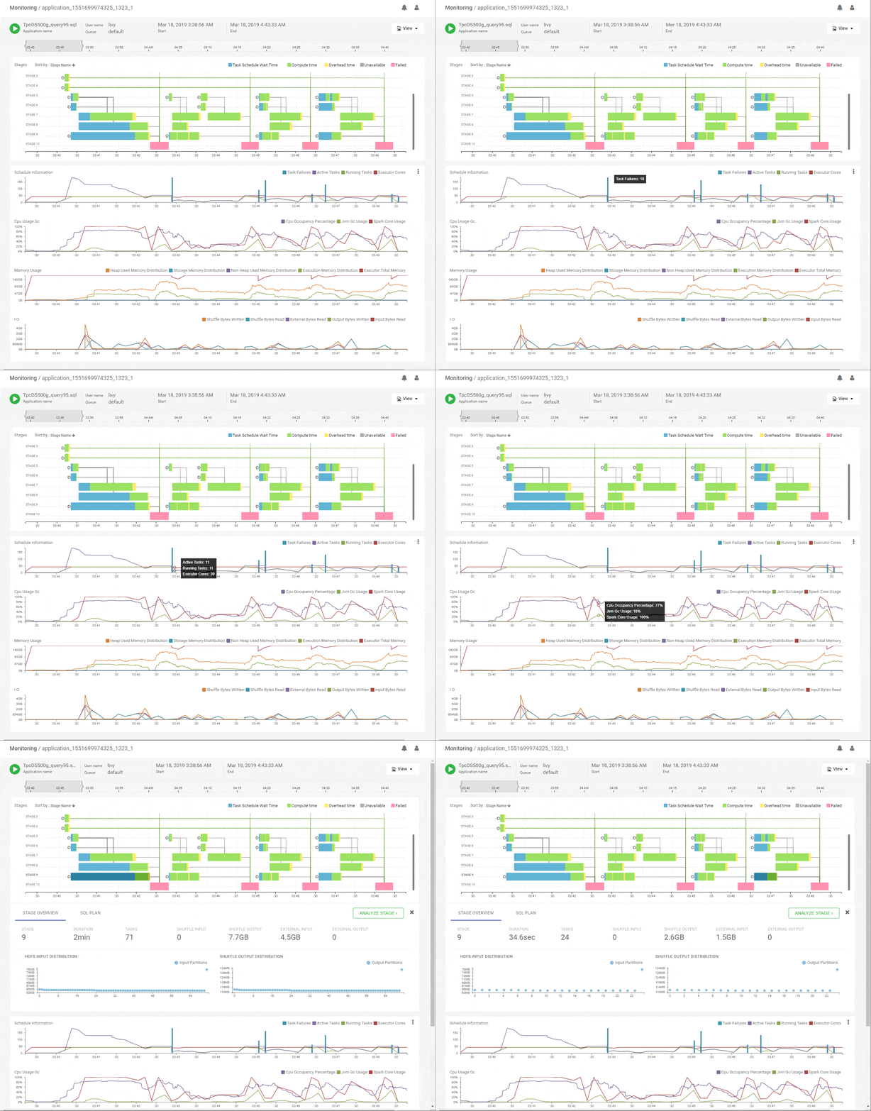
Jobs often fail and we are left wondering how exactly they failed. Even if the job does not fail outright, it may have task or stage level failures and re-executions that can make it run slower. It turns out that our DAG timeline view provides fantastic visibility into when and where failures happened and how Spark responded to them. Take a look here at a failed execution for a different query. It almost looks like the same job ran 4 times right? We can quickly see that stage-10 failed 4 times and each time it caused the re-execution of a number of predecessor stages. Eventually after 4 attempts Spark gave up and failed the job. Correlating stage-10 with the scheduling chart shows task failures as well as a reduction in executor cores, implying executors were lost. Correlating that on the CPU chart shows high JVM GC and memory chart shows huge memory usage. Using this, we could conclude that stage-10 used a lot of memory that eventually caused executor loss or random failures in the tasks. Thus, we have identified the root cause of the failure! We can assess the cost of the re-executions by seeing that the first execution of Stage-9 ran 71 tasks while its last re-execution re-ran 24 tasks – a massive penalty.
Looking ahead
Visualizing the above data for a wide variety of jobs showed that we are able to diagnose a fairly large number of patterns of issues and optimizations around Spark jobs. The next logical step would be to encode such pattern identification into the product itself such that they are available out of the box and reduce the analysis burden on the user. E.g. such rules could be used to provide alerts or recommendations for the cases we described above. This would be particularly attractive for newer users who are less familiar with Spark and also serve as a precursor for more automated job management systems – say alerting users about GC spikes in their jobs that might cause failures down the road. In fact, adding such a system to the CI/CD pipeline for Spark jobs could help prevent problematic jobs from making it to production.
We have made our own lives easier and better supported our customers with this – and have received great feedback as we have tried to productize it all in the above form. This is just the beginning of the journey and we’ve just scratched the surface of how Spark workloads can be effectively managed and optimized – thereby improving developer productivity and reducing infrastructure costs.
Stay up to date and learn more about Spark workloads with Workload XM.
Kudos to the team effort by Arun Iyer, Bikas Saha, Marco Gaido, Mohammed Shahbaz Hussain, Mridul Murlidharan, Prabhjyot Singh, Renjith Kamath, Sameer Shaikh, Shane Marotical, Subhrajit Das, Supreeth Sharma and many others who chipped in with code, critique, ideas and support.


