We posted several blog posts about sparklyr (introduction, automation), which enables you to analyze big data leveraging Apache Spark seamlessly with R. sparklyr, developed by RStudio, is an R interface to Spark that allows users to use Spark as the backend for dplyr, which is the popular data manipulation package for R.
If you are interested in sparklyr, you can learn how to use it with the official document, or you also can try it on a Spark cluster with Cloudera Director. In this blog post, we are going to build a Spark cluster on AWS with Cloudera Director. If you will try sparklyr, the official cheat sheet is very helpful.
In this post, we will show you the automated launch of sparklyr with Cloudera Director client and visualize and build a predictive model of US air flight.
Launch RStudio Server and sparklyr with Spark cluster by Cloudera Director
You can refer to the previous post about automated deployment with Cloudera Director, but this time we will use this configuration file for Cloudera Director client in my repository. This cluster.conf requires Cloudera Director 2.3 or higher and it assumes you will use the ap-northeast-1 region on AWS. You should change several settings such as the security group and subnet ID.
You can launch a cluster with Cloudera Director as follows:
$ cloudera-director bootstrap cluster.conf
If you have your own Cloudera Director server, you can deploy as follows:
$ cloudera-director bootstrap-remote cluster.conf –lp.remote.username=<director-username> –lp.remote.password=<director-password> –lp.remote.hostAndPort=<director-server-hostname>:7189
If you don’t have an environment with a Cloudera Director client, you can use a Docker-based tool.
Analyzing US flight data with sparklyr
In this post, we will show you a visualization and build a predictive model of US flights with sparklyr. Flight visualization code is based on this article: http://flowingdata.com/2011/05/11/how-to-map-connections-with-great-circles/
This post assumes you already have the following tables:
- Airlines data as airlines_bi_pq. It is assumed to be on S3, but you can put it into HDFS. See also the Ibis project.
- Airports data converted into Parquet format as airports_new_pq. See also 2009 ASA Data Expo.
You should make these tables available through Apache Hive or Apache Impala (incubating) with Hue.
After installation of sparklyr and instantiation of the Spark cluster with Cloudera Director configuration file, you can access the RStudio server on <sparklyr-gateway-hostname>:8787 with your browser and log in with rsuser/cloudera.
Connect to Spark with sparklyr
Let’s connect to your Spark cluster with sparklyr. In this post, we installed Spark 2.0 additionally. Before running the following code, you should install additional R packages as install.packages(c("ggplot2", "maps", "geosphere", "dplyr")).
library(ggplot2)
library(maps)
library(geosphere)

library(sparklyr)
library(dplyr)

# Connect to the cluster
config <- spark_config()
config$spark.driver.cores   <- 4
config$spark.executor.cores <- 4
config$spark.executor.memory <- "4G"
spark_home <- "/opt/cloudera/parcels/SPARK2/lib/spark2"
spark_version <- "2.0.0"
sc <- spark_connect(master="yarn-client", version=spark_version, config=config, spark_home=spark_home)
Read the table from S3 and plot with ggplot
Summarize flight number of airlines_bi_pq table by year.
airlines <- tbl(sc, "airlines_bi_pq")
airlines
## Source:   query [1.235e+08 x 30]
## Database: spark connection master=yarn-client app=sparklyr local=FALSE
##
##     year month   day dayofweek dep_time crs_dep_time arr_time crs_arr_time
##    <int> <int> <int>     <int>    <int>        <int>    <int>        <int>
## 1   2006     6     3         6      840          830     1006         1007
## 2   2006     6     4         7      830          830      958         1007
## 3   2006     6     5         1      827          830     1004         1007
## 4   2006     6     6         2      830          830     1006         1007
## 5   2006     6     7         3      831          830     1005         1007
## 6   2006     6     8         4      826          830      958         1007
## 7   2006     6     9         5      826          830      958         1007
## 8   2006     6    10         6      845          830     1011         1007
## 9   2006     6    11         7      828          830      950         1007
## 10  2006     6    12         1      829          830      956         1007
## # ... with 1.235e+08 more rows, and 22 more variables: carrier <chr>,
## #   flight_num <int>, tail_num <int>, actual_elapsed_time <int>,
## #   crs_elapsed_time <int>, airtime <int>, arrdelay <int>, depdelay <int>,
## #   origin <chr>, dest <chr>, distance <int>, taxi_in <int>,
## #   taxi_out <int>, cancelled <int>, cancellation_code <chr>,
## #   diverted <int>, carrier_delay <int>, weather_delay <int>,
## #   nas_delay <int>, security_delay <int>, late_aircraft_delay <int>,
## #   date_yyyymm <chr>
airline_counts_by_year <- airlines %>% group_by(year) %>% summarise(count=n()) %>% collect
airline_counts_by_year %>% tbl_df %>% print(n=nrow(.))
## # A tibble: 22 × 2
##     year   count
##    <int>   <dbl>
## 1   1990 5270893
## 2   2003 6488540
## 3   2007 7453215
## 4   2006 7141922
## 5   1988 5202096
## 6   1997 5411843
## 7   1994 5180048
## 8   2004 7129270
## 9   1991 5076925
## 10  1996 5351983
## 11  1989 5041200
## 12  1998 5384721
## 13  1987 1311826
## 14  1995 5327435
## 15  2001 5967780
## 16  1992 5092157
## 17  2005 7140596
## 18  2000 5683047
## 19  2008 7009728
## 20  1999 5527884
## 21  2002 5271359
## 22  1993 5070501
sparklyr’s table is evaluated lazily, so you should use collect to convert into a data.frame.
Plot summarized data with ggplot:
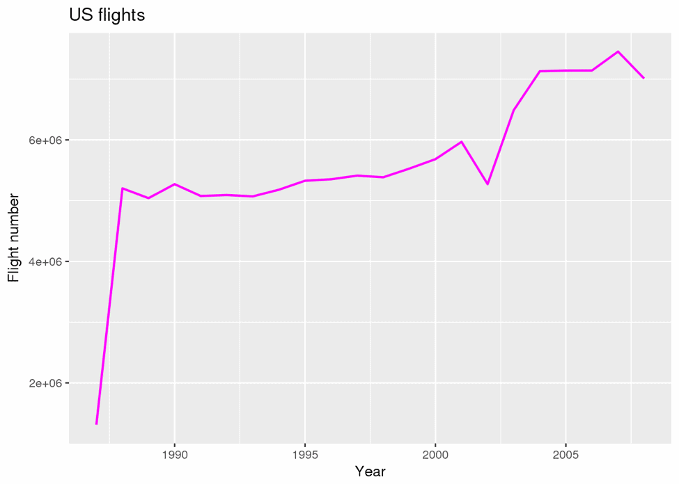
g <- ggplot(airline_counts_by_year, aes(x=year, y=count))
g <- g + geom_line(
 colour = "magenta",
 linetype = 1,
 size = 0.8
)
g <- g + xlab("Year")
g <- g + ylab("Flight number")
g <- g + ggtitle("US flights")
plot(g)

We found the decreasing of flight number in 2002. But why?
See flight number between 2001 and 2003
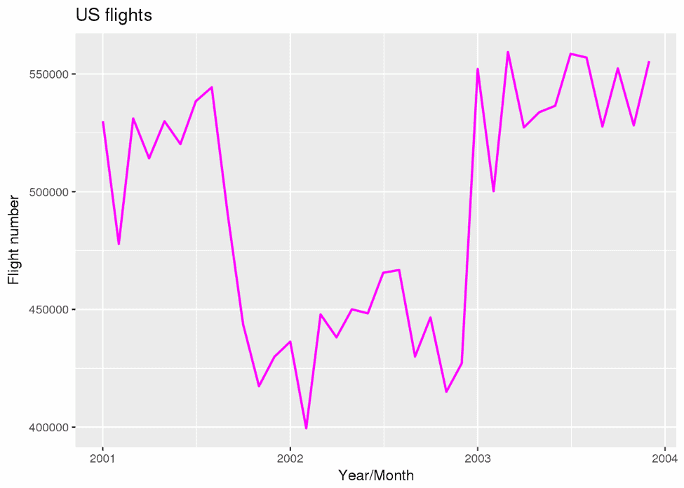
Next, to dig into the data in 2002, let’s plot the number of flights between 2001 and 2003.
airline_counts_by_month <- airlines %>% filter(year>= 2001 & year<=2003) %>% group_by(year, month) %>% summarise(count=n()) %>% collect

g <- ggplot(
 airline_counts_by_month,
 aes(x=as.Date(sprintf("%d-%02d-01", airline_counts_by_month$year, airline_counts_by_month$month)), y=count)
 )
g <- g + geom_line(
 colour = "magenta",
 linetype = 1,
 size = 0.8
)
g <- g + xlab("Year/Month")
g <- g + ylab("Flight number")
g <- g + ggtitle("US flights")
plot(g)

It appears that the number of flights after Sept. 2001 significantly decreased. We can understand it is the effect of 9/11. In this way, sparklyr makes exploratory data analysis easier for large-scale data, so we can obtain new insight quickly.
Summarize flight data by year, carrier, origin and dest
Next, we will summarize the data by carrier, origin and destination.
flights <- airlines %>% group_by(year, carrier, origin, dest) %>% summarise(count=n()) %>% collect
airports <- tbl(sc, "airports_new_pq") %>% collect
Now we extract AA’s flight in 2007.
flights_aa <- flights %>% filter(year==2007) %>% filter(carrier=="AA") %>% arrange(count)
flights_aa
## Source: local data frame [460 x 5]
## Groups: year, carrier, origin [82]
##
##     year carrier origin  dest count
##    <int>   <chr>  <chr> <chr> <dbl>
## 1   2007      AA    BOS   JFK     1
## 2   2007      AA    MIA   FLL     1
## 3   2007      AA    BOS   SDF     1
## 4   2007      AA    MIA   XNA     1
## 5   2007      AA    BNA   IAD     1
## 6   2007      AA    XNA   MIA     2
## 7   2007      AA    OGG   ORD     8
## 8   2007      AA    ORD   OGG     8
## 9   2007      AA    EGE   LGA    17
## 10  2007      AA    MTJ   ORD    17
## # ... with 450 more rows
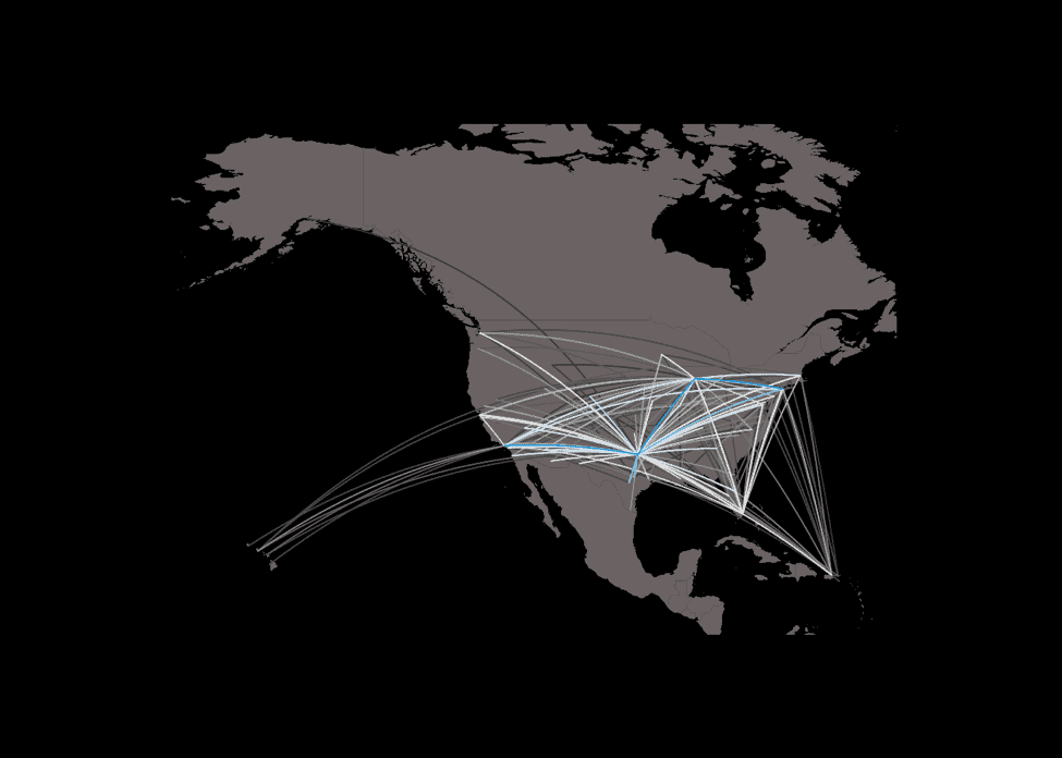
Plotting flights into map.
Let’s plot the flight number of AA in 2007 on a map. You can change the condition of a filter to plot other airlines.
xlim <- c(-171.738281, -56.601563)
ylim <- c(12.039321, 71.856229)
pal <- colorRampPalette(c("#333333", "white", "#1292db"))
colors <- pal(100)
map("world", col="#6B6363", fill=TRUE, bg="#000000", lwd=0.05, xlim=xlim, ylim=ylim)

maxcnt <- max(flights_aa$count)
for (j in 1:length(flights_aa$carrier)) {
 air1 <- airports[airports$iata == flights_aa[j,]$origin,]
 air2 <- airports[airports$iata == flights_aa[j,]$dest,]

 inter <- gcIntermediate(c(air1[1,]$longitude, air1[1,]$latitude), c(air2[1,]$longitude, air2[1,]$latitude), n=100, addStartEnd=TRUE)
 colindex <- round( (flights_aa[j,]$count / maxcnt) * length(colors) )

 lines(inter, col=colors[colindex], lwd=0.8)
}
Build a predictive model for delay with linear regression
We will build a predictive model with Spark MLlib. We use linear regression from MLlib.
First, we will prepare training data. In order to handle categorical data, you should use ft_string_indexer for converting to label indices.
partitions <- airlines %>%
 filter(arrdelay >= 5) %>%
 sdf_mutate(
      carrier_cat = ft_string_indexer(carrier),
      origin_cat = ft_string_indexer(origin),
      dest_cat = ft_string_indexer(dest)
 ) %>%
 mutate(hour = floor(dep_time/100)) %>%
 sdf_partition(training = 0.5, test = 0.5, seed = 1099)

fit <- partitions$training %>%
  ml_linear_regression(
    response = "arrdelay",
    features = c(
       "month", "hour", "dayofweek", "carrier_cat", "depdelay", "origin_cat", "dest_cat", "distance"
      )
   )

summary(fit)
## Call: ml_linear_regression(., response = "arrdelay", features = c("month", "hour", "dayofweek", "carrier_cat", "depdelay", "origin_cat", "dest_cat", "distance"))
##
## Deviance Residuals: (approximate):
##      Min       1Q   Median       3Q      Max
## -111.631   -7.860   -2.044    4.624 1434.686
##
## Coefficients:
##                Estimate  Std. Error   t value  Pr(>|t|)
## (Intercept)  1.1779e+01  1.6486e-02   714.468 < 2.2e-16 ***
## month       -4.6258e-02  9.8378e-04   -47.021 < 2.2e-16 ***
## hour        -1.5079e-01  7.4880e-04  -201.373 < 2.2e-16 ***
## dayofweek   -2.3504e-01  1.7646e-03  -133.195 < 2.2e-16 ***
## carrier_cat  1.4728e-01  7.2567e-04   202.951 < 2.2e-16 ***
## depdelay     9.0322e-01  8.7020e-05 10379.398 < 2.2e-16 ***
## origin_cat  -5.7124e-03  9.8910e-05   -57.753 < 2.2e-16 ***
## dest_cat    -2.3307e-02  9.4674e-05  -246.179 < 2.2e-16 ***
## distance     1.4307e-03  6.4905e-06   220.431 < 2.2e-16 ***
## ---
## Signif. codes:  0 '***' 0.001 '**' 0.01 '*' 0.05 '.' 0.1 ' ' 1
##
## R-Squared: 0.8333
## Root Mean Squared Error: 16.33
Now, we can see the trained linear regression model and its coefficients.
Summary
Using sparklyr enables you to analyze big data on Amazon S3 with R smoothly. You can build a Spark cluster easily with Cloudera Director. sparklyr makes Spark as a backend database of dplyr. You can create tidy data from huge messy data, plot complex maps from this big data the same way as small data, and build a predictive model from big data with MLlib. I believe sparklyr helps all R users perform exploratory data analysis faster and easier on large-scale data. Let’s try!
You can see the Rmarkdown of this analysis on RPubs. With RStudio, you can share Rmarkdown easily on RPubs.
Learn more about sparklyr and Cloudera in this on-demand video.


Hello, how can I find a airlines_bi_pq-like table? Thank you.
Hi Iskander, I think you can find it here,
s3://us-west-2-aws-training/awsu-spl/spl-17/4.2.6.prod/data/flights-usa
or Kaggle
https://www.kaggle.com/yuanyuwendymu/airline-delay-and-cancellation-data-2009-2018/data